
Accordion
Description
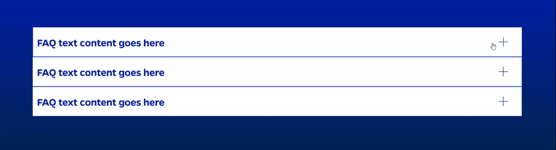
Inserts an interactive accordion to present content in an expandable and collapsible format, which allows users to view only the content they are interested in while hiding the rest.
On-page Example
To preview a live example of the component or inspect the code, click the link below
Component Specifications
| Item/Field | Description | Required/Optional |
|---|---|---|
| Accordion Item | Number: No limit Hover: Grey background in headline area Active: Grey background in full content area, + changes to - |
NA |
| Title | Field type: Single line text Wrapping: Single line |
Required |
| Accordion Content | Field type: WYSIWYG | Required |
| Button Text | Field type: Single line text | |
| Destination | Field type: URL field Includes option to open in new tab |
|
| Animation | None | NA |
| Mobile Response | User is anchored to top of accordion heading when they expand it | NA |
| Page Placement | Content width | NA |
| Accessibility | Accordion headings/content links are included in tab through | NA |
When to Use
- When presenting a list of items with expandable and collapsible content.
- When you want to save space on your webpage by hiding content until it's needed.
- When displaying Frequently Asked Questions (FAQs) or step-by-step instructions.
When to Consider Something Else
- When the content you are displaying is short and can be easily displayed without the need for an accordion.
- When a different UI pattern, such as tabs or cards, would be more effective for the content.
How to Use
- Place the accordion where it is relevant within your page.
- Customize the accordion titles and content as needed.
- Add or delete accordion items as required.
Accessibility Tips
- Ensure each accordion title is descriptive and provides context for the content within the accordion item.
- Use appropriate ARIA attributes (aria-expanded, aria-controls) to convey the current state of the accordion item to screen readers.
Resources
- Bootstrap Accordion: https://getbootstrap.com/docs/5.1/components/accordion/
- W3C Accordion Example: https://www.w3.org/TR/wai-aria-practices-1.1/examples/accordion/accordion.html
- ARIA Accordion Design Pattern: https://www.w3.org/TR/wai-aria-practices-1.1/#accordion
Categories
Navigation