
Alert Banner
Description
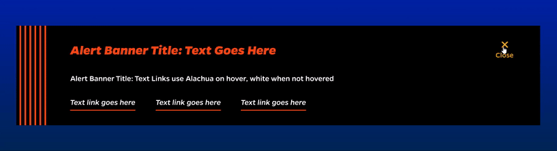
A black alert banner that displays urgent and relevant information above the navigation at the very top of the website.
On-page Example
To preview a live example of the component or inspect the code, click the link below
Component Specifications
| Item/Field | Description | Required/Optional |
|---|---|---|
| Heading | Field type: Single line text Text: Styled text Character Recommendation: 45 Wrapping: Single line |
Recommended |
| Description | Field type: Multi line text field, linking available Text: Paragraph Character Recommendation: 300-500 characters Wrapping: Wrap as needed Hover: Inline links will change to gold |
Recommended |
| Buttons Fields: Button Text Destination |
Field type: Button field Character Recommendation: NA Wrapping: Single line Number: Up to three Hover: : Underline will scroll to the right and change to white |
Recommended |
| Appearance | The alert banner can be toggled on/off to display above the global navigation area on the homepage, select pages or all pages. |
NA |
| Accessibility | Link, buttons, and close will be included in tab through | NA |
When to Use
This component should be used to display details about an emergency alert advisory.
When to Consider Something Else
Do not use this component if you want to just include information about an upcoming event or any other occurrence that is not an emergency.
How to Use
Type a brief, specific paragraph that includes all of the most important facts about the upcoming emergency like a storm or on-campus threat. Also include two links beneath the short paragraph; one for student resources and another for faculty and staff.
Accessibility Tips
Please make sure to not add any other alterations or styling to the text displayed in this component to ensure that screen-readers will understand the text, and that the text will be visible against a dark background.
Categories
Calls to Action