
Cards - Text + Image
Description
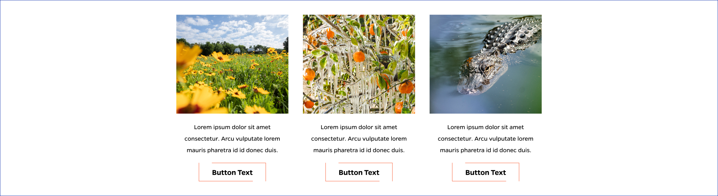
Up to three horizontal cards with a top image, a central text area, and a bottom button.
On-page Example
To preview a live example of the component or inspect the code, click the link below
Component Specifications
| Item/Field | Description | Required/Optional |
|---|---|---|
| Title | Field type: Single line text Text: H2 Character Recommendation: 25 Wrapping: Single line |
Optional |
| Card |
Link: Button is clickable |
Required |
| Card – Image | Field Type: Media upload/select field Aspect Ratio: 1.13:1 Optimal Image Dimensions: 369x326 |
Required |
| Card – Description | Field type: Single line text Text: Paragraph Character Recommendation: 90 Wrapping: Wrap to two lines |
Required |
| Card – Link Text | Field type: Single line text Text: Styled text Character Recommendation: 25 Wrapping: Single line |
Required |
| Card – Link Destination |
Field type: Link field | Required |
| Mobile Response | Stack elements vertically | NA |
| Page Placement | Full Width | NA |
| Accessibility | Cards are included in tab through and active state will duplicate the hover state. Tab through will advance through the cards from left to right. |
NA |
When to Use
Use when you need an image above text with a button underneath.
When to Consider Something Else
If you need the image, text, and link button in a different visual style, or if the text you need is too long.
How to Use
Insert an image, fill in the text for the image and the button, and then choose a link target.
Accessibility Tips
Make sure the text is accessible against the background color.