
Cards - Text only
Description
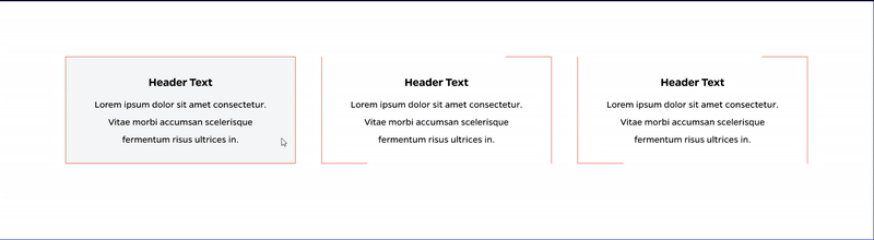
Up to 3 cards with text inside an animated border
On-page Example
To preview a live example of the component or inspect the code, click the link below
Component Specifications
| Item/Field | Description | Required/Optional |
|---|---|---|
| Title | Field type: Single line text Text: H2 Character Recommendation: 25 Wrapping: Single line |
Optional |
| Card | Link: Entire card area is clickable Hover: Orange outline closes and background changes to grey (for accessibility the outline needs to be at least 4 px) Number: No limit Display: Up to three cards in a row, fewer cards will center |
Required |
| Card – Title | Field type: Single line text Text: Styled text Character Recommendation: 25 Wrapping: Single line |
Required |
| Card – Description | Field type: Single line text Text: Paragraph Character Recommendation: 90 Wrapping: Wrap to two lines |
Optional |
| Card – Destination | Field type: Link field | Required |
| Mobile Response |
Only the first card displays on page load, user may swipe or use the navigation arrows to view additional cards |
NA |
| Page Placement | Full Width | NA |
| Accessibility | Cards are included in tab through, and active state will duplicate the hover state. Tab through will advance through the cards from left to right. | NA |
When to Use
Use when no image is needed. This is just a title and brief text that can be used as a link button.
When to Consider Something Else
If an image or a lot of text is needed, another content type may be better.
How to Use
Fill in title and text for each card desired, as well as a link if desired. Empty cards should be excluded from the output.
Accessibility Tips
Make sure the text is accessible against the background color.