
Showcase Text + Image
Description
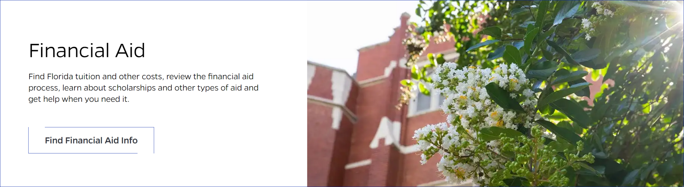
A content block that has a header, detail text, a button, and a related image that has the option to appear on the left or right of the text content. The button can link to related content highlighted in the text portion of this block. The image in this content block also has a parallax effect when a user scrolls up/down the page.
On-page Example
To preview a live example of the component or inspect the code, click the link below
Showcase text with image example
Component Specifications
| Item/Field | Description | Required/Optional |
|---|---|---|
| Image | Field Type: Media upload/select field Optimal Image Specs: 1.75:1 ratio, Dimensions 1120 X 640 |
|
| Title | Field type: Single line text field Text: H2 Character Recommendation: 45 Wrapping: Wrap to three lines |
Required |
| Description | Field type: Multi line text field Wrapping: Wrap to three lines |
Optional |
| Link Text | Field type: Button Character Recommendation: 20 Wrapping: Single line Number: Up to 2 Hover: outline closes and background changes to grey |
Optional |
| Link Destination | ||
| Animation | Image is parallax | NA |
| Mobile Response | Text is stacked below image | NA |
| Page Placement | Full width | NA |
| Accessibility | Buttons are included in tab through | NA |
When to Use
This component should be used to give a brief overview of important information so that the user can be prompted to click a link to see a page with more information related to what is displayed in this content block.
When to Consider Something Else
Do not use this component if you do not plan to link the user to a page with more information related to what is in this content block.
How to Use
Type in a header, include detail text in a short paragraph below it, and add some text and a link to the button below that. Next, add an image that you want to display.
Accessibility Tips
Please make sure to add alt text to the image and include clear, relevant text in the text content portions of the block.
Categories
Featured Content