
Showcase—Text Only
Description
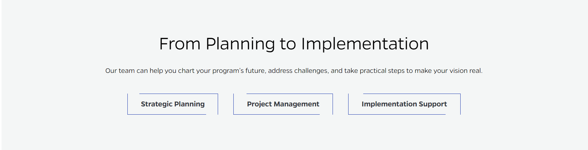
Inserts a full-width text block, sometimes called a CTA, with a title, text, and up to 3 buttons.
On-page Example
To preview a live example of the component or inspect the code, click the link below
Component Specifications
| Item/Field | Description | Required/Optional |
|---|---|---|
| Title | Field type: Single line text Text: H2 Heading Character Recommendation: 35 Wrapping: Single line WordPress: Option to set H1 or H2 |
Required |
| Description | Field type: Multi line text Text: Paragraph Character Recommendation: 140 Wrapping: Single line |
Optional |
| Buttons | Hover: Outline closes, background turns to white Number: One to three buttons may be added |
Optional |
| Buttons - Text | Field type: Single line text Text: Styled text Character Recommendation: 30 Wrapping: Single line |
Required |
| Buttons - Destination |
Field type: Link field | Required |
| Mobile Response | Elements stack | NA |
| Page Placement | Full width | NA |
| Accessibility | Buttons are included in tab through, left to right | NA |
When to Use
- On pages with full-width Page layouts
- When you have content you want to call attention to on the website
- When you want to link to important content not located on the current page
When to Consider Something Else
- On text-heavy content
- On content requiring more than 3 links/buttons
How to Use
Fill in the title and optional description text as desired. At least one of the three buttons is required. Fill in the required button text and destination fields. If more buttons are required fill in the corresponding button text and destination fields as desired.
Accessibility Tips
- Make sure the links, if used, has text that describes the destination sufficiently, even when out of context.