
Tab Block
Description
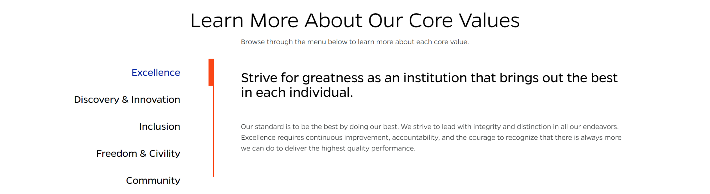
Inserts a set of tabs that allows users to navigate through different sections of content without leaving the current page. Tabs provide an organized and space-saving way to display related content.
On-page Example
To preview a live example of the component or inspect the code, click the link below
Component Specifications
| Item/Field | Description | Required/Optional |
|---|---|---|
| Tab Item | Number: 10 Hover: Text changes to blue Active: Blue text, Orange bar along vertical line |
NA |
| Title | Field type: Single line text Text: H3 Character Recommendation: 25 Wrapping: Single line |
Required |
| Tab Content | Field type: WYSIWYG | Required |
| Button Link | Field type: URL field Includes option to open in new tab |
|
| Animation | Thick orange bar will slide to indicate what tab it’s on | NA |
| Mobile Response | Appears as accordion in mobile. User is anchored to top of accordion when they expand it. |
NA |
| Page Placement | Full width | NA |
| Accessibility | Tab headings/content links are included in tab through |
NA |
When to Use
- When displaying related content that can be organized into separate sections.
- When you want to save space on your webpage by showing only one section of content at a time.
- When displaying different aspects of a single topic or multiple steps in a process.
When to Consider Something Else
- When the content is not related or cannot be easily organized into separate sections.
- When a different UI pattern, such as an accordion or a simple list, would be more effective for the content.
How to Use
- Place the tabs where they are relevant within your page.
- Customize the tab titles and content as needed.
- Add or delete tabs and their corresponding content as required.
Accessibility Tips
- Ensure each tab title is descriptive and provides context for the content within the tab.
- Use appropriate ARIA attributes (role, aria-controls, aria-selected) to convey the current state of the tab to screen readers.
Resources
- Bootstrap Navs and Tabs: https://getbootstrap.com/docs/5.1/components/navs-tabs/
- WAI-ARIA Authoring Practices for Tabs: https://www.w3.org/TR/wai-aria-practices-1.1/#tabpanel
- ARIA Tabs Design Pattern: https://www.w3.org/TR/wai-aria-practices-1.1/#tabpanel
Categories
Navigation